berxi
"My Payment" redesign
How might we empower users to easily resolve pending payments while keeping the experience effortless for users without any dues?
.png)
overview
Berxi is a technology-driven insurance platform built to deliver a better experience for individuals and small businesses. Berxi provides small businesses with a growing range of commercial insurance products, including errors & omissions, medical malpractice, and general liability.
This project
When customers buy insurance with Berxi, they can pay in full or in installments. This project focused on redesigning the existing "My Payment" page to eliminate any sources of customer confusion and create a streamlined payment process that would enhance the overall user experience.
goal
1. Customers who have a payment due can resolve it quickly.
2. Customers who don't have payment due don't have to bother.
01. Research
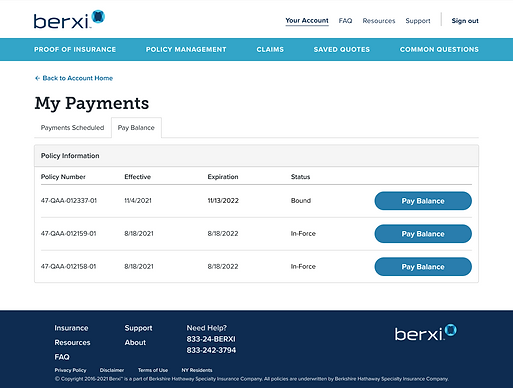
original my payments

"Payments scheduled" tab

"Pay balance" tab

"Payments" page
understanding the problem
To understand the problem from different perspectives, I talked to different departments and did some primary research myself
.png)
Customer Support
01
Discover most common questions as well as uncommon user scenarios and edge cases that may not have been considered during the initial design process.
02
Product owner
Understand the business goals, priorities, and constraints.
Map out user journeys and visualize the paths users take to complete the task or at what point they drop off.
03
Heaps
current design
"Payments scheduled" tab

-
The order of the scheduled payments shows the last installment first and not the upcoming (current) payment, meaning that if the last installment is sometime next year, they will see that first instead of the one that is due next month
-
Big numbers scare people away.
-
Whether "pay now" is for future or failed payments is unclear. Needs a proper error message.
-
The "Pay now" button is too small and tucked at the bottom of the page.
-
Unnecessarily repetitive information
-
No need for a column when it's the same information
"Pay balance" tab
Payment method page

-
When it's actually failed payment because the current payment method is invalid, there's no way for people resolve it from the page.
-
They have to update it in the account page and come back to pay it here.
-
Most users assume the "Pay Balance" tab is for failed installment payments and try to resolve it even when they don't have anything due.
-
"Pay balance" is actually for paying in full.
Mobile view

-
Too many columns and table structures are not mobile-friendly. There's no clickable button.
02. Ideate
user stories
Since there were too many things going on in the original design, it was important to understand what exactly users will want to accomplish when arriving at "My Payment" page. I created user stories which gave the team a clear vision on what our goals for this design must accomplish. They were organized from high, medium to low priority to later reflect the information hierarchy of design.

how might we

HMW confirm customers' automatic payment?
HMW handle errors or issues that may arise during the payment process?
HMW provide clear and transparent information about the total cost of insurance, both for paying in full and in installments?
How will the payment page adapt to different screen sizes and devices?
HMW present the payment schedule for installments in a user-friendly way?
HMW instill trust and confidence in users when collecting payment information?
design principles
.png)
Mobile first
01
To fix a busy web design, starting with mobile first requires designers to be more selective, remove unnecessary clutter, and prioritize the most critical elements.
02
Don't make people think
When it comes to insurance, people don't think about it until something happens. Most people pay and forget about it. Don't bother them unless it's time to renew.
03
Insurance purchases require users to make important decisions about something they can't foresee. It's designer's job to empower users to make informed choices with confidence.
Avoid jargon
UI objectives
More icons
Fewer buttons
Consolidate related information
Remove irrelevant details
wireframes


03. Design
Use case 1: Users are on autopay and don't have to do anything

Group information by policy
-
Present pricing information prominently and clearly
-
Remind users that they are on autopay and have already paid for this month, so they don't have to do anything
-
Assure them again by providing a specific next due date and payment method on file.
Payment progress
Small CTA buttons for optional and non-urgent actions.
The "Pay in full" option is still accessible but not emphasized.
Key information summarized at the top for quick and easy access
Accordion to reduce redundant information
Divide payments into 2 groups, "Upcoming" and "past" payment, to improve search effiency

Upcoming payment
-
During the design process, we were debating whether we should allow users to manually and respectively pay for future installments or not. We decided to not do that to avoid extra work for users and over-complicate our system.
-
The due date is in chronicle order.

Payment history
-
Users have the option to download the receipt all together above or individually here.
-
There's enough information (date, amount, and payment type) for users to skim through without downloading the reciept.
Use case 2: Users have overdue payment

Tooltip to signify policy with failed payment
Emphasize overdue task
CTA that users can do instantly from the page

Edit payment method page
As mentioned above, before, when users need to update their payment method, they have to do it in their "Account," under "Payment Method." There was no way for them to do it directly from this page. This redesign adds a net new flow to "My Payment" and "Payment Method" pages, which is part of a bigger project that I've also done at Berxi.
*Allow users to save new payment method
Use case 3: Users already paid in full

Transparent about renewal date
Big zeros to relieve people
Green check to further emphasize

Pay in full flow

.png)

Mobile view


prototype

04. Reflection
Joining a relatively small company without a dedicated design team, I had the opportunity to wear multiple hats and contribute end-to-end, from research and problem framing to design execution.
This experience also highlighted the importance of a design system within the workflow. It became clear that a well-defined design system enables more autonomous work, supports faster iteration, and streamlines the implementation of design solutions.
As a result of the redesign, the experience led to a 25% improvement in resolving failed payments, demonstrating the impact of improving clarity and reducing friction in the payment flow.